Web develop - Layout
Make sure the layout is suitable for the user
Use relative size to allow changing text size and responsive design #
Target: Everyone and especially people with visual impairments, using a device outdoors and elderly people.
When: during development.
Description:
Use relative length units for font size (em, rem, %) and for containers handling text size enlargement up to 200% and design your pages to be responsive.
Checklist:
- Do not use pixel (
px) for size that must adapt if we increase the text size (impossible with Internet Explorer). - Form fields must also have relative sizes to enlarge properly.
- Try to make the container adaptive so they can increase in size when the text is zoomed in.
- In Firefox, go to View>Zoom and activate Zoom text only, set the zoom to 200%. Verify that there is no loss of information (disappearance or overlapping text).
- Content must respond to screen size changes, unless special needs (map, table, diagram... ), adjusting its contents without horizontal scrolling for a viewport reduced to 320 pixels CSS wide for content with a horizontal reading direction, or without vertical scrolling for a viewport reduced to 256 pixels CSS high for content with a vertical reading direction.
Users’ goal:
Allow users (visually impaired, using a device outdoors, elderly people…) to increase the font size and enlargement of the page so they can access easily the information.
Example:
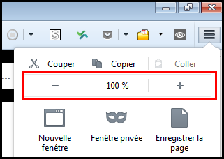
See the example handling zoom, increasing the text size for more details.
WCAG reference:
Allow text spacing #
Target: Everyone, particularly people with visual disabilities.
When: as of design and during development.
If the user applies the following settings, the text must remain legible (no truncated content, superimposed):
- The line height must be adjustable to at least 1.5 times the font size.
- The space between two paragraphs must be adjustable to at least 2 times the font size.
- The letter spacing must be adjustable to 0.12 times the font size.
- The word spacing between words must be adjustable to at least 0.16 times the font size.
This can be done by applying the following CSS rules:
  * {
      line-height: 1.5!important;
      letter-spacing:.12em!important;
      word-spacing: .16em !important;
  }

  p {
      margin-bottom: 2em!important;
  }
Bookmarklet:
To ease the test, use the following bookmarklet (to keep in your bookmarks): Text spacing
Users’ goal:
Improve reading comfort for people with cognitive and visual disabilities.
WCAG reference:
Ensure a comprehensible reading order #
Target: Everyone, and in particular people with visual or cognitive impairments or with an attention deficit disorder and mobility.
When: during development.
Description:
If a specific reading order is necessary for a good understanding of the content or the use of the interface, it must be ensured that the order of appearance in the HTML code also allows the access, for any user, to the content and the interface.
To be checked:
- Provide that the order of appearance of the elements in the HTML code is the same as the reading order of the information in the page, if this impacts the understanding of the content or ability to use the interface. It's the simplest solution!
- Even during the appearance or disappearance of content or dynamically generated content, this understandable reading order and a usable interface must be kept.
User goal:
Allow content to be understood and used, especially for AT users who often read content in order of appearance in code.
Do:
A press site presents its articles in three columns. In the code, the columns are placed in the same order as displayed on the screen. In this case, all users can read the articles without difficulty.
Don't:
The main menu of a site is present at the very end of the source code (after the footer) but it positioned at the top of the page via CSS, there's a risk of not being perceived by a screen reader user.
WCAG reference:
Identify and maintain consistency of groupings and different regions of the page #
Target: Everyone, especially people with visual, cognitive or attention deficit disorders.
Description:
Provide ways to identify and visually distinguish the different parts of the page and ensure the consistency of these regions or groupings in all pages.
Checklist:
- Make sure that the navigation mechanisms are always located at the same place in a set of pages.
- Ensure that the components and groupings that have the same function are identified (visually and semantically) in the same way.
- Ensure that the areas of the page are clearly delimited (borders, edges, sufficient contrast ...) or that there is a way to visually distinguish the groups (sub-menu, drop-down list ...) as well as the different regions of the page.
User Objective:
Allow users to identify and locate interface elements in all pages.
Do:
Here, the tooltip (tooltip) is delimited by a visible edge and sufficiently contrasted, to identify its content.
Don't:
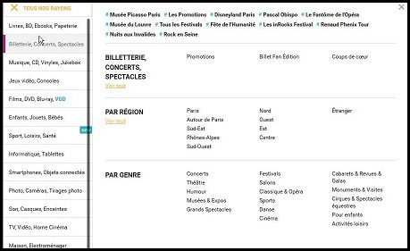
It is very difficult to associate the themes ("par region", "par genre", ...) and the sub-themes in columns, especially since the horizontal borders are too little contrasted.
**Example: The HTML5 and landmarks ARIA **
To give a semantic structure to the main regions of a page, we can use the HTML5 </ abbr> structure tags (main for the main content of the page, nav for the main navigation, header for page header, footer for footer, aside for content complementary to the main content, and others) even if their support by assistive technologies / browsers is not total , it's enough. You can also use, to set up this page structure, the landmarks ARIA (Accessible Rich Internet Applications) and there, the support is much better & nbsp ;!
Setting up this type of semantics allows visually impaired people to identify and understand the organization, the overall structure of the page and thus navigate more easily.
WCAG reference:
Define sensitive areas of sufficient size #
Target: Everyone, especially people with motor or visual disabilities and mobility.
When: during design and development.
Description:
Each sensitive area must have a sufficient size (minimum 9mm width and height).
In addition, the sensitive areas must be sufficiently spaced from each other (about 2mm minimum).
Decoupling content from interaction and presentation #
Target: Everyone, especially people with visual disabilities, reading or attention difficulties.
When: during development.
Description:
Strictly decouple the content (HTML), the interaction (Javascript) and presentation (CSS).
Checklist:
- Do not use tables to design the page layout, they should be used only for tabular data.
- Do not use image to display text, except when the visual presentation cannot be achieved using CSS.
- Use CSS classes rather than manipulating inline CSS styles in HTML.
- Do not use CSS pseudo-elements (::before, ::after…) to display information (or provide an alternative for screen readers especially).
- Do not write Javascript events directly inside the HTML, use a separate script or JS file instead.
Users’ goal:
Allow users, via their User Agent or technical assistance (e.g. their browser) to change the visual appearance of the page (zoom, colour, position…). For example, increase the text size without display problems.
Technical goal:
Improves maintainability.
WCAG reference:
Give access to the content regardless of the orientation of the screen #
Target: Everyone, especially people with motor or visual disabilities and mobility.
When: during design and development.
Description:
Access to the content must not depend on the orientation of the screen (portrait and landscape) unless a specific display orientation is essential (e.g. serious game).
WCAG reference: