Android develop - Vocal navigation
Vocalize the images #
Target: everyone and in particular people with visual impairments.
When: from design, and during development.
Description:
Images must have a text alternative that gives all the information carried by the image to users using voice navigation.
For an image containing text, the alternative will be the text. For an image which provides information in the form of a graph, drawing or other, the alternative will contain all the necessary information present in the image.
Decorative images do not require a text alternative and therefore should not be vocalized.
To be verified:
- Images carrying information convey this information through their textual alternatives.
Valid example:
<TextView
…
android:id="@+id/myTextviewId"
android:contentDescription="@string/criteria_alt_ex1_cd_txt2"
/>
myTextView = (TextView) findViewById(R.id.myTextviewId);

myTextView.setContentDescription(getString(R.string.criteria_alt_ex1_cd_txt2));
myTextViewId.contentDescription = getString(R.string.criteria_alt_ex1_cd_txt2)
// With Jetpack Compose
Image(
        painterResource(id = R.drawable.ic_launcher_foreground),
        contentDescription = "Content description for visually impaired"
    )
WCAG reference:
Vocalize all significant elements #
Target: everyone and in particular the visually impaired.
When: from design, and during development.
Description:
When a user navigates using voice navigation (Talkback for example), every meaningful element on the screen must be vocalized, to be able to use the application without any loss of information.
A text is restituted natively by the screen reader, but some elements require a text alternative to be able to vocalize the information correctly.
It is important to provide a text alternative when the information is not available or sufficient natively, e.g. for components conveying information through color, shape, position, sound... All components can receive a text alternative, so it is possible to enrich the native vocalization of an element.
Some images are sometimes associated with text to provide information. For example to present the "unread messages": a tooltip gives the unread messages number and an image gives the "message" information. In this case, the solution is to use a text alternative on the text with all the necessary information. For example: "3 unread messages". It is also possible to use this alternative on the image, but it is necessary to make the text "invisible" for the screen reader.
To be verified:
- Elements are all vocalized and accessible.
- The vocalizations are explicit and understandable for each element.
- The interactive elements are vocalized with the associated action.
- The titles of the activities are vocalized.
- Items in a list are vocalized independently of each other.
Example:
Example of an icon that is coupled with text (tooltip) to add information. The icon "mail" coupled with the tooltip value "3" indicates that we have "3 unread mails". If no textual alternative is added, 2 elements will be vocalized "button without label" and "3".

containerView.setContentDescription("3 mails non lus, bouton"); //On ajoute l’alternative complète (construite dynamiquement au préalable) sur le conteneur
containerView.setImportantForAccessibility(View.IMPORTANT_FOR_ACCESSIBILITY_YES); //Le conteneur est une View, non visible par l’API d’accessibilité par défaut. On le rend visible.
mailImageView.setImportantForAccessibility(View.IMPORTANT_FOR_ACCESSIBILITY_NO); //On masque le bouton-icône pour éviter une redondance d’information
infobulleTextView.setImportantForAccessibility(View.IMPORTANT_FOR_ACCESSIBILITY_NO); //On masque le texte pour éviter une redondance d’information
containerView.contentDescription = "3 mails non lus, bouton" //On ajoute l’alternative complète (construite dynamiquement au préalable) sur le conteneur

containerView.importantForAccessibility = View.IMPORTANT_FOR_ACCESSIBILITY_YES //Le conteneur est une View, non visible par l’API d’accessibilité par défaut. On le rend visible.

mailImageView.importantForAccessibility = View.IMPORTANT_FOR_ACCESSIBILITY_NO //On masque le bouton-icône pour éviter une redondance d’information

infobulleTextView.importantForAccessibility = View.IMPORTANT_FOR_ACCESSIBILITY_NO) //On masque le texte pour éviter une redondance d’information
// With Jetpack Compose
Box(modifier = Modifier.semantics(mergeDescendants = true) {}) {
        Image(
            painterResource(id = R.drawable.ic_launcher_foreground),
            contentDescription = null,
            modifier = Modifier.padding(8.dp)
        )
        Box (modifier = Modifier.align(Alignment.TopEnd)
            .background(color = Color.Red, shape = CircleShape)
            .size(20.dp)) {
            Text(
                text = "3",
                fontSize = 14.sp,
                color = Color.White,
                modifier = Modifier
                    .align(Alignment.Center)
                    .semantics {
                        this.contentDescription = "3 mails non lus"
                    }
            )
        }

    }
WCAG reference:
Vocalize the state of the elements #
Target: everyone and in particular the visually impaired.
When: during development.
Description:
If an element does not vocalize its status, nature or state, the TalkBack user is unable to understand what is happening on the screen.
The different types of tabs offered in Android, for example, do not give all the information about their nature and status. It is up to the developer to give this information to the user via the corresponding accessibility attributes (contentDescription). In this case, a good alternative for the title of a tab can be: "selected, tab title, tab 1 of 3".
Another classic element that does not vocalize by default its state: the foldable zones.
To provide this kind of information, the contentDescription attribute (available for any element inheriting from View) must be used.
To be verified:
- Any element whose status can be modified during the use of the application must convey its state through its text alternative. For example, an item that can be selected/unselected.
Example of tabs:
The example shows tabs above and below a ViewPager in one case in TabLayout and in the other in BottomNavigationView. Tabs are no longer practiced as TabHost.
It is necessary to indicate the state and the nature of the tabs (not internationalized):
//In the activity layout
<android.support.constraint.ConstraintLayout
   …>
    <android.support.v4.view.ViewPager
    android:id="@+id/viewpager"
        …
        >
    <android.support.design.widget.TabLayout
            android:id="@+id/tabtoolbar_pager"
            …
    </android.support.v4.view.ViewPager>
    <android.support.design.widget.BottomNavigationView
        android:id="@+id/navigation"
        […]
        app:menu="@menu/navigation" />
</android.support.constraint.ConstraintLayout>


//Dans le fichier strings.xml
<string name="cd_tab_title_param">%1$s, onglet %2$s sur %3$s</string>
    @Override
    protected void onCreate(Bundle savedInstanceState) {
        super.onCreate(savedInstanceState);
        setContentView(R.layout.activity_main);
        mTabLayout = (TabLayout) findViewById(R.id.tabtoolbar_pager);
        mViewPager = (ViewPager) findViewById(R.id.viewpager);
        mTabLayout.addOnLayoutChangeListener(mTabLayoutListener);
        mTabLayout.setupWithViewPager(mViewPager);
        mAdapter = new ScreenSlidePagerAdapter(getSupportFragmentManager());
        mViewPager.setAdapter(mAdapter);
//initializes the contentDescription at creation
        updateTabContentDescription(0);
        mViewPager.addOnPageChangeListener(new ViewPager.OnPageChangeListener() {
            […]
            public void onPageSelected(int position) {
                updateTabContentDescription(position);
            }
        });
//The BottomNavigationView is not necessarily at the bottom of the view, it has to be positioned in the layout.
        BottomNavigationView navigation = (BottomNavigationView) findViewById(R.id.navigation);
        navigation.setOnNavigationItemSelectedListener(mOnNavigationItemSelectedListener);
        […]
        }
    private void updateTabContentDescription(int position) {
        for (int i = 0; i < mAdapter.getCount(); i++) {
            TabLayout.Tab tab = mTabLayout.getTabAt(i);
            String cd_param_string = getString(R.string.cd_tab_title_param,
                    mAdapter.getPageTitle(i), // titre en paramètre 1 voir le xml
                    i + 1,                    // le numéro de l’onglet actuel, paramètre 2
                    mAdapter.getCount());     // le nombre d’onglets automatique, paramètre 3
            if (tab != null) {
                tab.setContentDescription(cd_param_string);
            }
//For Tablayout and BottomNavigationView the "selected" information is already vocalized.
//Or, for example: "selected, `title tab 1`, tab 1 of 5 ".
//or "title tab 3", tab 3 on 5. ". Then " `press twice to activate ".
// Setting the upper terminal automatically prevents you from ending up with a vocalization of the type :
//"selected, `title tab 4`, tab 4 on 3. ", where the upper bound is inconsistent.
// For the `TabHost` it would be necessary in addition to specify the information " selected ".
        }
    }
    private fun updateTabContentDescription(position: Int) {
        for (i in 0 until mAdapter!!.count) {
            val tab = mTabLayout!!.getTabAt(i)
            val cd_param_string = getString(R.string.cd_tab_title_param,
                    mAdapter!!.getPageTitle(i), // title in parameter 1 see the xml
                    i + 1,                      // the number of the current tab, parameter 2
                    mAdapter!!.count)           // the automatic number of tabs, parameter 3
            if (tab != null) {
                tab.contentDescription = cd_param_string
//For Tablayout and BottomNavigationView the "selected" information is already vocalized.
//Or, for example: "selected, `title tab 1`, tab 1 of 5 ".
//or "title tab 3", tab 3 on 5. ". Then " `press twice to activate ".
// Setting the upper terminal automatically prevents you from ending up with a vocalization of the type :
//"selected, `title tab 4`, tab 4 on 3. ", where the upper bound is inconsistent.
// For the `TabHost` it would be necessary in addition to specify the information " selected "..
            }
        }
    }
Example of element states using Jetpack Compose:
// With Jetpack Compose
val stateSubscribed = stringResource(R.string.subscribed)
val stateNotSubscribed = stringResource(R.string.not_subscribed)
Row(
		modifier = Modifier.semantics {
			stateDescription = if (selected) stateSubscribed else stateNotSubscribed
		}
		....
    )
WCAG reference:
Write good text alternatives #
Description:
Writing good text alternatives is essential to make it easier for screen reader users to understand. Writing a good alternative depends on what you want to describe.
- Icons: Icons are frequently used to represent a button or to display a status. In the case of a button, it is better to use a verb to write the text alternative. For example, a Favorite button represented by a heart could be described as "Add movie to favorite" rather than "Heart" or "Favorite". In the case of an icon representing a state, the state that is represented must be described. For example, if we have an icon representing a microphone crossed out, the textual alternative could be "Muted".
- Texts: texts are generally very well managed natively by Android, the text displayed will be the one that will be vocalized, so it is not necessary to add a textual alternative. On the other hand, it is sometimes necessary to be careful, if you use symbols or abbreviations. For example, for the text "02/05/92", a textual alternative must be added to vocalize "2 May 1992". (it is also possible in this case to use a
TtsSpan). - Images: the case of images is more complex and is detailed in this chapter
Manage the vocalization order #
Target: everyone and in particular the visually impaired.
When: from design, and during development.
Description:
The focus order of the default screen reader depends on several parameters: the "logical" reading, from left to right and from top to bottom, and the reading of the XML (order of declaration of the elements). It is possible to redefine this reading order with two tools :
accessibilityTraversalAfter: takes anidin parameter and allows to specify to the view that it must be described by the accessibility API after the view was passed in parameter.accessibilityTraversalBefore: takes anidin parameter and allows to specify to the view that it must be described by the accessibility API before the view is passed in parameter.
Note: these attributes can be used directly in the XML but also in the code via the setAccessibilityTraversalAfter and setAccessibilityTraversalBefore methods. These methods are available for any element that inherits from View.
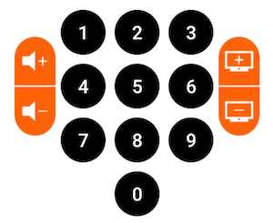
Example:
In this example, the default reading order is completely dependent on the order in which elements are declared. In this case: vol+, vol-, 1, 2, 3, 4, 5, 6, 7, 8, 9, p+, p-, 0. A more consistent reading order would be 1, 2, 3, 4, 5, 6, 7, 8, 9, 0, vol+, vol-, p+, p-.
volupButton.setAccessibilityTraversalAfter(myView.findViewById(R.id.remote0).getId());
voldownButton.setAccessibilityTraversalAfter(myView.findViewById(R.id.volup).getId());
chaineplusButton.setAccessibilityTraversalAfter(myView.findViewById(R.id.voldown).getId());
chainemoinsButton.setAccessibilityTraversalAfter(myView.findViewById(R.id.chaineplus).getId());
volupButton.accessibilityTraversalAfter = remote0.id
voldownButton.accessibilityTraversalAfter = volup.id
chaineplusButton.accessibilityTraversalAfter = voldown.id
chainemoinsButton.accessibilityTraversalAfter = chaineplus.id
To be verified:
- The vocalization order follows an understandable and logical order.
WCAG reference:
Vocalize content change #
Target: everyone and in particular the visually impaired.
When: from conception, and during development.
Description:
When content is dynamically modified after a user action, it must be vocalized. Otherwise, a blind user cannot understand that an action has been triggered.
A simple vocalization may be sufficient to notify the user. It is very easy to trigger vocalizations with TalkBack : you just need to use the announceForAccessibility method.
Note: the announceForAccessibility method is available on any element that inherits from View.
It is also possible to specify to a view that it is a live region, i.e. its content can be dynamically modified. This will result in generating vocalizations with TalkBack for example. A typical example of use: on a form, if the user makes an error and an error message appears, the view containing the message must be defined as a live region.
The method setAccessibilityLiveRegion takes as parameter a mode. There are 3 modes:
ACCESSIBILITY_LIVE_REGION_NONE: this view is not a live region. This is the default value for most views.ACCESSIBILITY_LIVE_REGION_POLITE: vocalizations are performed on the view changes. These vocalizations are "polite" and have a lower priority than system vocalizations for example.ACCESSIBILITY_LIVE_REGION_ASSERTIVE: vocalizations are performed on the view changes. These vocalizations are " rude ". They are prioritized and immediately vocalized.
Note: the setAccessibilityLiveRegion method is available on any element that inherits from View.
To be verified:
- Temporary messages displayed on the screen (such as Toast) are vocalized.
- Dialogs opening are vocalized.
- Transitions between activities are vocalized (by the title of the new activity for example).
- Error messages are vocalized.
- Horizontal scrolls are vocalized.
- The change of a part of the screen is vocalized.
- The change of a screen element is vocalized if it is useful for the user to be informed about it.
Example of triggering a vocalization:
It is common to test the Android version before triggering TalkBack vocalization. Indeed, announceForAccessibility only works since Android Jelly Bean version.
if (Build.VERSION.SDK_INT >= Build.VERSION_CODES.JELLY_BEAN) {
    myView.announceForAccessibility(getString(R.string.criteria_contentchange_ex1_announce));
    }
if (Build.VERSION.SDK_INT >= Build.VERSION_CODES.JELLY_BEAN) {

myView.announceForAccessibility(getString(R.string.criteria_contentchange_ex1_announce))

}
Example of a live region:
<TextView
   […]
   android:accessibilityLiveRegion="polite" />
Example with jetpackcompose:
@Composable
fun PoliteAccessibilityRegion() {
Column {
Text(
text = "Contenu mis à jour pour l'accessibilité",
modifier = Modifier.accessibilityLiveRegion(AccessibilityLiveRegion.Polite)
)
}
}
Do not vocalize the decorative and hidden elements. #
Target: everyone and in particular the visually impaired.
When: from design, and during development.
Description:
To avoid confusion for a screen-reader user, it is necessary to vocalize only the significant elements. Decorative elements, such as illustrations, should not be vocalized.
Although invisible on the screen, some elements could be read by the screen reader (elements positioned outside the visible area or hidden by other elements). Overlaying frames is common, but it creates very heavy accessibility problems if it is not done correctly.
A frequent case of this problem: fragments. A bad use of fragments can lead to an impossible navigation with the screen reader.
See the article on use of fragments for more information.
To be verified:
- No invisible elements are vocalized.
- Decorative elements are ignored and are not vocalized.
Examples:

By decomposing the image:
 no
no contentDescription
imageView.setContentDescription("settings")
imageView.setContentDescription("edit the image's name")
    <ImageView
        android:id="@+id/montagnard"
        android:src="@drawable/montagnard"
        android:contentDescription="@null"
        ... />
    <ImageButton
        android:id="@+id/settings"
        android:src="@drawable/settings"
        android:contentDescription="@string/settings"
        ... />
    <ImageButton
        android:id="@+id/edit"
        android:src="@drawable/edit"
        android:contentDescription="@string/edit"
        ... />
// With Jetpack Compose
Image(
        painterResource(id = R.drawable.montagnard),
        contentDescription = "null"
    )
Image(
        painterResource(id = R.drawable.setting),
        contentDescription = stringResource(R.string.settings)
    )
Image(
        painterResource(id = R.drawable.edit),
        contentDescription = stringResource(R.string.edit)
    )
WCAG reference:
Group the elements #
Target: everyone and in particular the visually impaired.
When: from design, and during development.
Description:
It is recommended to group similar elements for vocalization when this increase efficiency and comprehension.
For example, in a music application, it is more useful to group together the music title, artist name and duration vocalization in one block, rather than vocalizing them separately and making navigation more cumbersome.
Care must be taken to find the right balance between navigation and vocalization. Vocalizing too much information in one block will be detrimental to listening. Having no elements grouped together will increase the amount of navigable elements and therefore make navigation more cumbersome.
To be verified:
- Linked elements are grouped in the same block of announcements for vocalization.
- Multidimensional information respects a good balance between the number of blocks and the number of contents in each block.
Example of a grouped vocalization:
<ConstraintLayout
    android:id="@+id/song_data_container" ...
    android:screenReaderFocusable="true">

    <TextView
        android:id="@+id/song_title" ...
        android:focusable="false"
        android:text="@string/my_song_title" />
    <TextView
        android:id="@+id/song_artist"
        android:focusable="false"
        android:text="@string/my_songwriter" />
</ConstraintLayout>
// With Jetpack Compose
Row(
	verticalAlignment = Alignment.CenterVertically,
	modifier = Modifier.semantics(mergeDescendants = true) {}
	) {
Text(
        text = stringResource(R.string.my_song_title),
        fontSize = 14.sp,
    )
Text(
        text = stringResource(R.string.my_songwriter),
        fontSize = 14.sp,
    )
}
WCAG reference:
Enable header navigation #
Target: everyone and in particular the visually impaired.
When: from design, and during development.
Description:
Within the same screen, content is sometimes split into different sections, with a header for each of them. It is possible with the Talkback screen reader to navigate by headings, rather than by elements. This makes it faster for a user to navigate between sections.
To recognize headers, an attribute in the XML layout must be added to the elements : accessibilityHeading
To be verified:
- Headers are navigable with the Talkback Navigation "Heading" setting
Example:
<TextView
[…]
android:id="@+id/myTextLevel1viewId"
android:accessibilityHeading="true"
/>
// With Jetpack Compose

Text(
        text = stringResource(R.string.myTextLevel1viewId),
        fontSize = 14.sp,
		modifier = Modifier.semantics { heading()}
    )
WCAG reference:
Hide elements from the accessibility API #
Target: everyone and in particular people with visual and/or motor impairments.
When: from the design phase and during development.
Description:
It is possible via an accessibility attribute to hide elements to accessibility tools (TalkBack for example). By extension, it is possible to force some elements to be visible to accessibility tools.
ImportantForAccessibility : depending on the value of the attribute, this indicates that an element is visible or not from the accessibility API.
auto(0): default value, the system decides. For example, aButtonwill have its default value at 1 (yes) and aLinearLayoutat 2 (no).yes(1): the view is important for accessibility. It can for example receive the focus of TalkBack.no(2): the view is not important for accessibility. It no longer triggers an accessibility event and is therefore ignored by services such as TalkBack.noHideDescendants(4): the view is not important for accessibility, but all its child views are. It hides all the elements of a view from accessibility at once. Very useful on custom elements.
Note: the importantForAccessibility attribute is available for any element that inherits from `View'.
Examples:
<TextView
[…]
android:id="@+id/myTextviewId1"
android:importantForAccessibility="4"
/>
<TextView
[…]
android:id="@+id/myTextviewId2"
android:importantForAccessibility="noHideDescendants"
/>
myTextView1 = (TextView) findViewById(R.id.myTextviewId1);

myTextView2 = (TextView) findViewById(R.id.myTextviewId2);

myTextView1.setImportantForAccessibility(4); // JELLY_BEAN

myTextView2.setImportantForAccessibility(View.IMPORTANT_FOR_ACCESSIBILITY_NO_HIDE_DESCENDANTS); // KITKAT
myTextView1.importantForAccessibility = 4 // JELLY_BEAN

myTextView2.importantForAccessibility = View.IMPORTANT_FOR_ACCESSIBILITY_NO_HIDE_DESCENDANTS  // KITKAT
Detect if TalkBack is enabled #
Description:
Under Android, it is possible to know if the Accessibility API is enabled, and by extension to know if TalkBack is enabled.
Example:
AccessibilityManager am = (AccessibilityManager) context.getSystemService(ACCESSIBILITY_SERVICE);
boolean isAccessibilityEnabled = am.isEnabled();
val am = context.getSystemService(Context.ACCESSIBILITY_SERVICE) as AccessibilityManager

val isAccessibilityEnabled = am.isEnabled