Momindum Maker recommandations
The best practices detailed in this article apply to the Momindum Maker tool, allowing you to create video presentations from a Powerpoint document.
It is therefore imperative as a prerequisite to apply the Powerpoint recommendations on the document serving as the basis for the presentation.
Project properties #
Provide at least the title and the language.
-
Project title
The title of the project is included in the page title and in the main title.
These are 2 very important things for screen reader users. -
Language
The choice of language defines the translation of the navigation elements (eg: play / pause, navigation menu, etc.).

Offer alternatives to audio and video tracks #
-
Closed captions
- Offer subtitles as an alternative to the audio track (automatic transcription is adapted, or .SRT subtitles)
- Do not offer embedded subtitles in the video
-
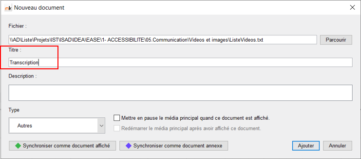
Transcription
- Provide a full transcription of the video as a text file (txt, word, html)
- Make sure to fill in an understandable title for the document

Define a plan #
-
The plan system generated by Momindum is accessible.
It can in particular be used from a keyboard navigation or a screen reader, and prove to be very useful for navigation within the presentation. -
It is imperative that the wording is relevant.

Quizz #
Momindum quizzes can be used (see however the remarks in the paragraph accessibility defects .
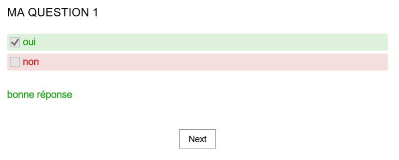
- However, propose the result in the form of text, because the information (good / bad answer) is given only by color (it will not be perceived by blind or visually impaired users).

Accessibility defects #
While good practices can make a Momindum Maker presentation usable, there are still some drawbacks that impact end users:
-
Autoplay:
Play / pause actions are not possible from keyboard navigation.
It is therefore necessary to offer automatic reading, contrary to the usual recommendations, in order not to block keyboard users. -
Quizz :
It is possible to take the quizz from technical help, however:- Perception of responses should be improved.
Screen reader users may not perceive them depending on their browsing mode. - Answers are selected systematically in the form of a checkbox.
However, when only one answer is possible, the radio button format is more suitable.
Screen reader users could be misled.
- Perception of responses should be improved.