Storyline 360 recommandations
Recommendations for making an accessible e-learning presentation.
Note : in addition, the general editorial recommendations (colors, make reading easier, etc.) must also be applied, but are not described in this article.
Personalize the user experience from the start #
Provide instructions from the first slide #
Users must be able to know and anticipate the navigation mechanisms.
- Provide textual instructions from the first slide
- These instructions provide all the shortcuts specific to e-learning
- For screen reader users, we suggest adding keyboard navigation instructions
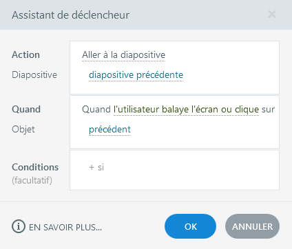
Give the choice between different profiles #
The goal of accessibility is to provide a single interface that can be used by all users.
However, e-learning has specific features, such as serious games for example, which can prevent the implementation of an interface without degradation of the experience for all users.
The solution is therefore to offer the choice of profiles.
The content (serious game, exercises, etc.) can be adapted to the context of each user.
- Propose alternative mechanisms (example: replacing a drag n’drop system for example)
- Offer additional content (example: addition of detailed descriptions for screen readers)

Allow to use the main functions of the application through a keyboard interface #
This is to allow users who cannot use the mouse (blind, motor impaired, etc.) to access the main functionalities of the application from the keyboard.
- Ensure that all interactive elements are usable from the keyboard
- Focus on native components (radio, checkbox, button) offered by Storyline
- Do not use systems that only rely on mouse interaction, such as:
- drag n’drop
- the "hover" state to transmit important information
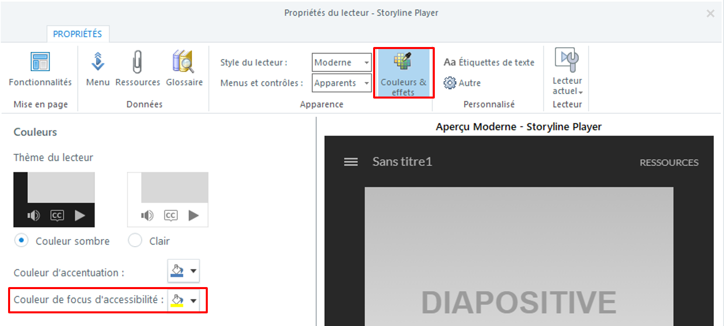
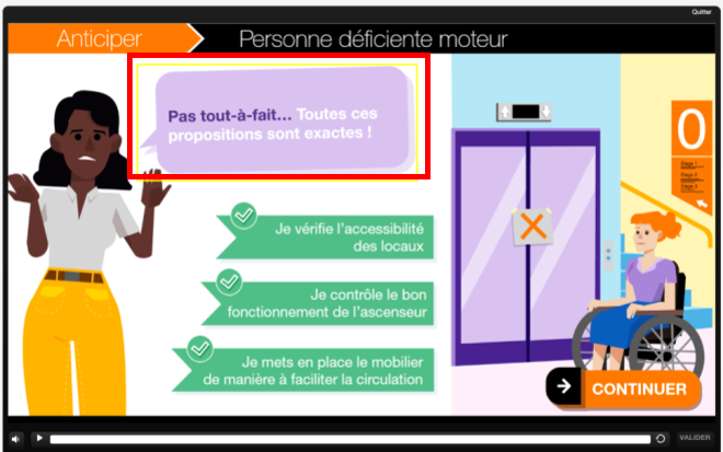
Make the focus visible in all circumstances #
A visible focus indicator allows keyboard users to know which component is currently active.
- Activate "Player properties"
- Select "Colors & Effects"
- Change the default focus color
Ensure that the user keeps control during interactions #
Know the result of your actions #
The results of quizzes in particular must be perceived by all users.
- Use Storyline's native notification components (feedback layers)
- Start a vocalization of the result after submission by the user
Avoid time limits #
All users must be able to complete their actions without unexpected behavior, such as a slide change for example.
- Avoid time limits to complete an exercise or a quiz, read content
- If a time limit is essential for carrying out an exercise, offer an alternative (possibility of deactivating or modifying the time limit, or proposing a different exercise depending on the profile for example)
Conversely, it may be useful to specify the time required for viewing alternative content, or viewing e-learning.
Organize objects and texts in a logical way #
For all users, whatever their method of browsing (screen reader, screen magnifier, keyboard navigation), the reading order of the components on the screen will correspond to the reading direction of the language of the document (therefore from left to right and from top to bottom for an interface in French for example)..
- In general, make sure to reproduce a logical reading order (left to right and top to bottom depending on the language used)
- Make sure that the order of the items allows the information to be understood. For example, in a questionnaire make sure that users move the focus or vocalize first on the question, then on the choice of answers
- If control buttons are used (submit button, next button), place them at the bottom right of the slide, so that they are read last
- Avoid layouts on several columns so as not to disrupt the understanding of information
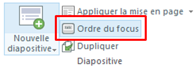
The procedure:
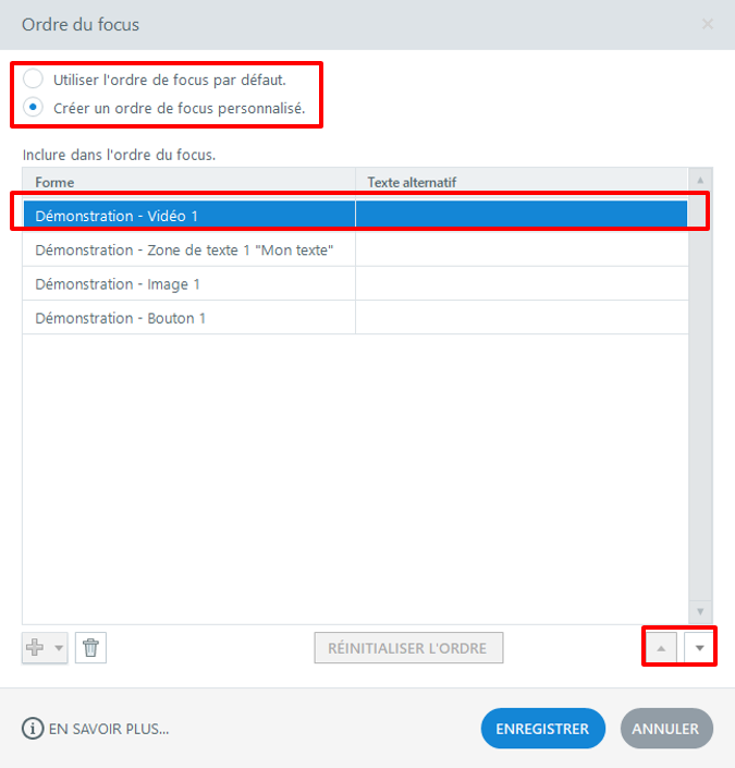
- Activate the "Focus order" function
- The "Focus Order" dialog box opens. This centralizes all the elements of the slide
- Select "Create a custom focus order"
- Select an item
- Use the "up / down" arrows to change the order of the item
- Activate "save"
Give a title to the presentation and slides #
Presentation title #
The presentation title must be explicit.
It allows end users to identify the training in their browser.
This is especially important for users of screen readers.
The procedure:
- Click on Publish
- Go to the "Web" tab of the dialog box
- Complete the "Title" field


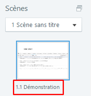
Slide title #
The slide title should also be self-explanatory.
It allows end users to understand the context of each new slide.
Especially screen reader users, indeed this element will be vocalized automatically upon arrival on a new slide.
Structure the content with headings #
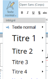
Apply heading styles to texts presented as heading.
Headings are essential for screen reader users to understand the structure of content and navigate easily within it.
Provide relevant alternative texts #
Alt text is essential for blind users.
It is this content that will be vocalized.
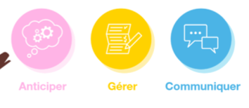
- Invalid alternative: button-gerer-1.png
- Valid alternative: Gérer
The recommendations:
- For images with text, the alternative text includes the textual content present in the image
- For buttons and other form elements, the alternative text conveys the target or the action carried by the button
- It is counterproductive to begin texts with "image of". Be concise and provide only the information that is necessary for the user
- Avoid abbreviations and repetition of punctuation elements
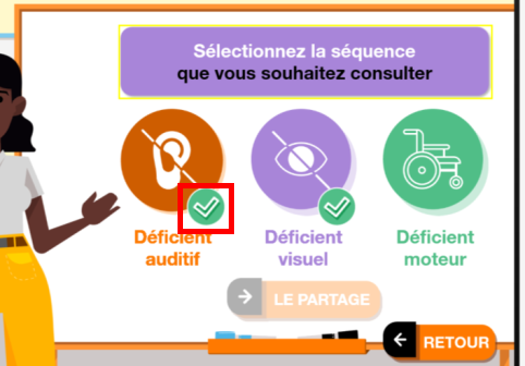
- Invalid alternative: coche.png
- Valid alternative: hearing impaired sequence already consulted
The procedure:
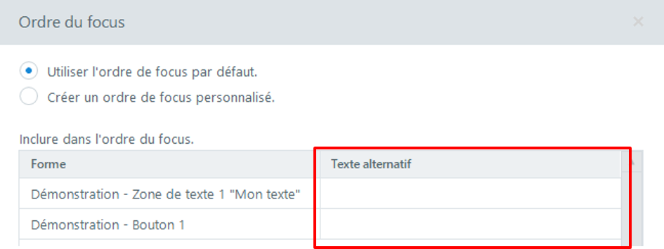
- Activate the "Focus order" function
- The "Focus Order" dialog box opens. This centralizes all the elements of a slide
- Enter the alternative text of buttons or objects carrying information
- Click on "Save"

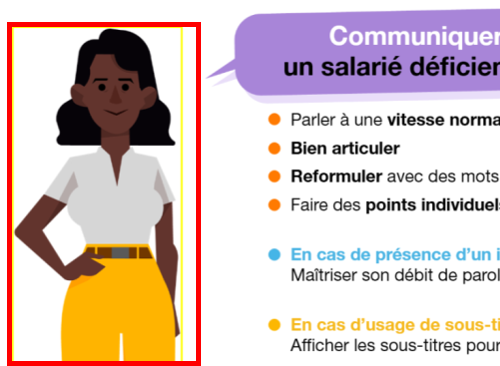
Hide decorative images #
An image is considered decorative when it does not provide additional information for the understanding of a text or a feature.
It is recommended that you hide these items from screen reader users.
Profits :
- Lighten vocalization, avoiding the reading of information useless to understanding the content
- Simplify keyboard navigation by removing unnecessary elements from the keyboard path
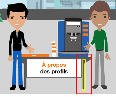
The procedure:
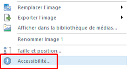
- Right click on the image
- Select "Accessibility" in the menu
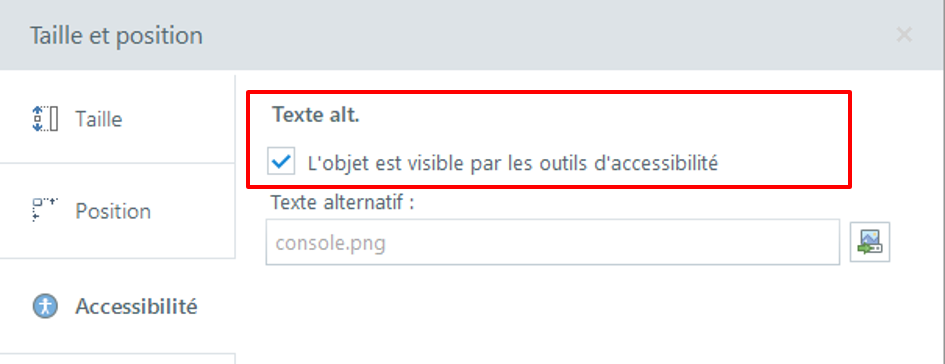
- The "size and position" dialog box opens
- The "Accessibility" tab is open by default
- Uncheck the box "The object is visible ..."
- Click on "close"
Indicate the main language of the document #
Defining the language of a document will allow screen readers to adapt their vocalization to the language of the content.
The procedure:
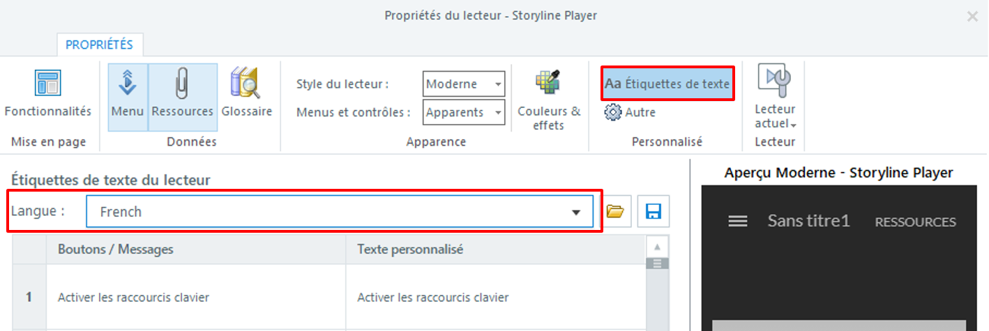
- Select "player - modify reader properties"
- Select "text labels"
- In the "language" drop-down menu, select the language corresponding to the document
- Edit the texts in the "personalized text" column
- Click on “OK”
Audio or video content #
- Provide transcription for audios and videos
- Do not start audio or video automatically
- If the media starts automatically, make sure the user has the option to stop it manually

Accessible audios #
Some formations have a vocalization of each slide (voice over):
- If the voice provides information not present in the content of the slide, then subtitles are necessary.
Storyline enables the creation of synchronized captions. - Make sure that all textual content on the slide is vocalized, so as not to mislead blind users who may rely solely on audio and not manually view all of the slide's content.

Accessible videos #
See Accessibility of video, animation and audio content to learn more.